Most of my work gears itself towards a documentary style of shooting; sports and event photography, and my work in news often demand a “realistic” approach to shooting and editing. I’ve noticed this approach seeping into my personal photography when it really doesn’t have to. Over the past few months, I’ve been practicing more creative editing and shooting approaches. I recently wrote about my experience shooting with a film lens on my camera, and today I thought I’d talk about my first real foray into color grading.
At first, I thought that to color grade photos well, you need a great understanding of color theory. While it certainly helps to understand a bit of the why behind how color can affect a viewer’s experience with your work, when you’re just experimenting with color like I have been, it isn’t necessary. I started by finding images from social media or stills from movies that I liked and trying to recreate that look.
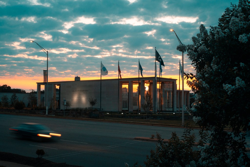
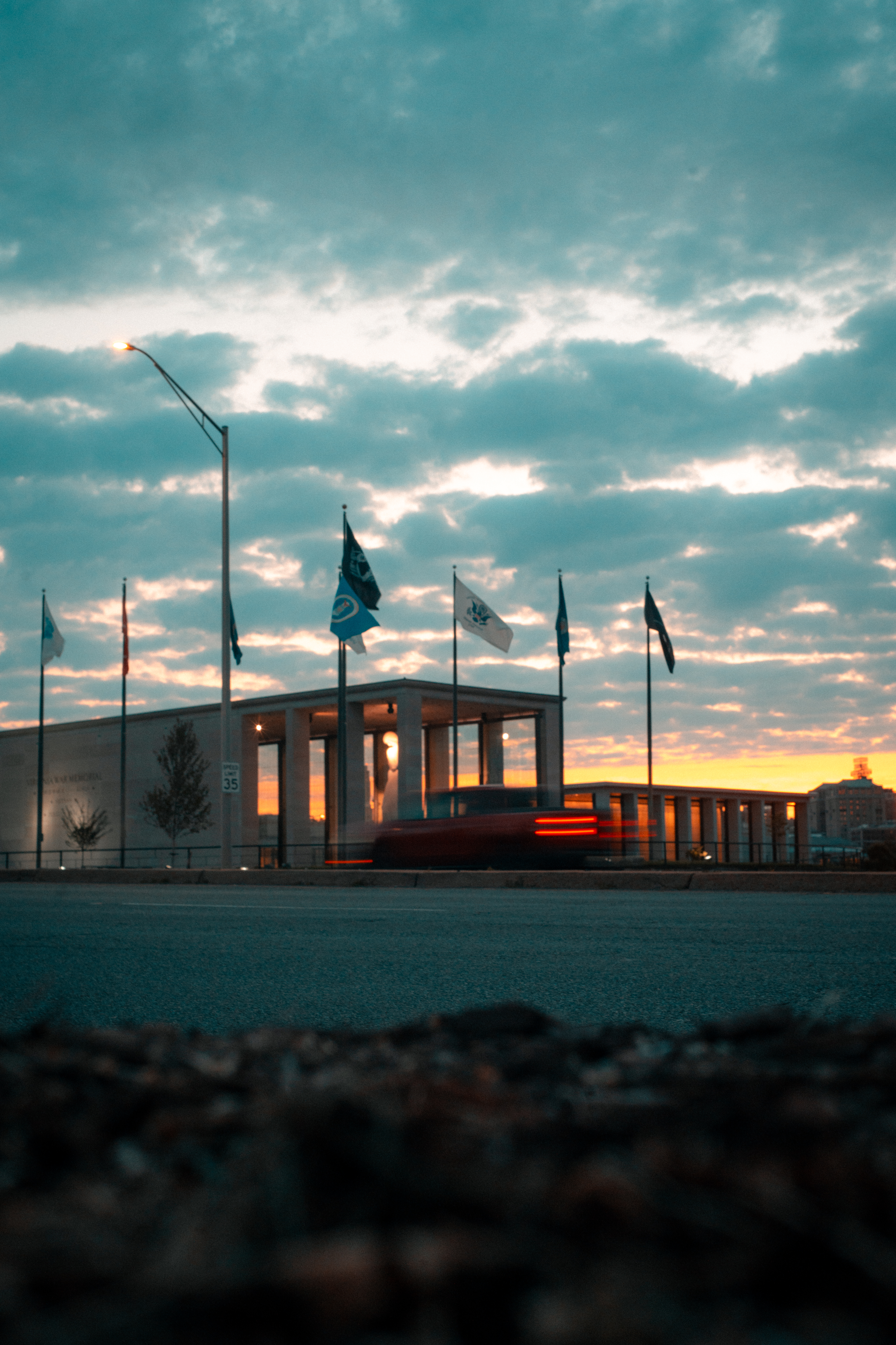
The look I wanted to emulate the most was the classic “teal and orange” look. It’s used all over the place, so I thought I’d try my hand at that first. That look creates some great vibrancy to images, especially when taken around sunrise/sunset, and adds an overall warm tone to the image, which I tend to lean towards anyways.
After watching a few different tutorials on how people achieve the look in Lightroom, I felt confident enough to put my own twist on it. Starting with a base of adjusting the calibration of the colors, I tried different levels on the HSL sliders to find something that I felt embodied the warm and vibrant tones I was looking for.

This was the first image I tried my new settings on and I’m really happy with how it turned out.
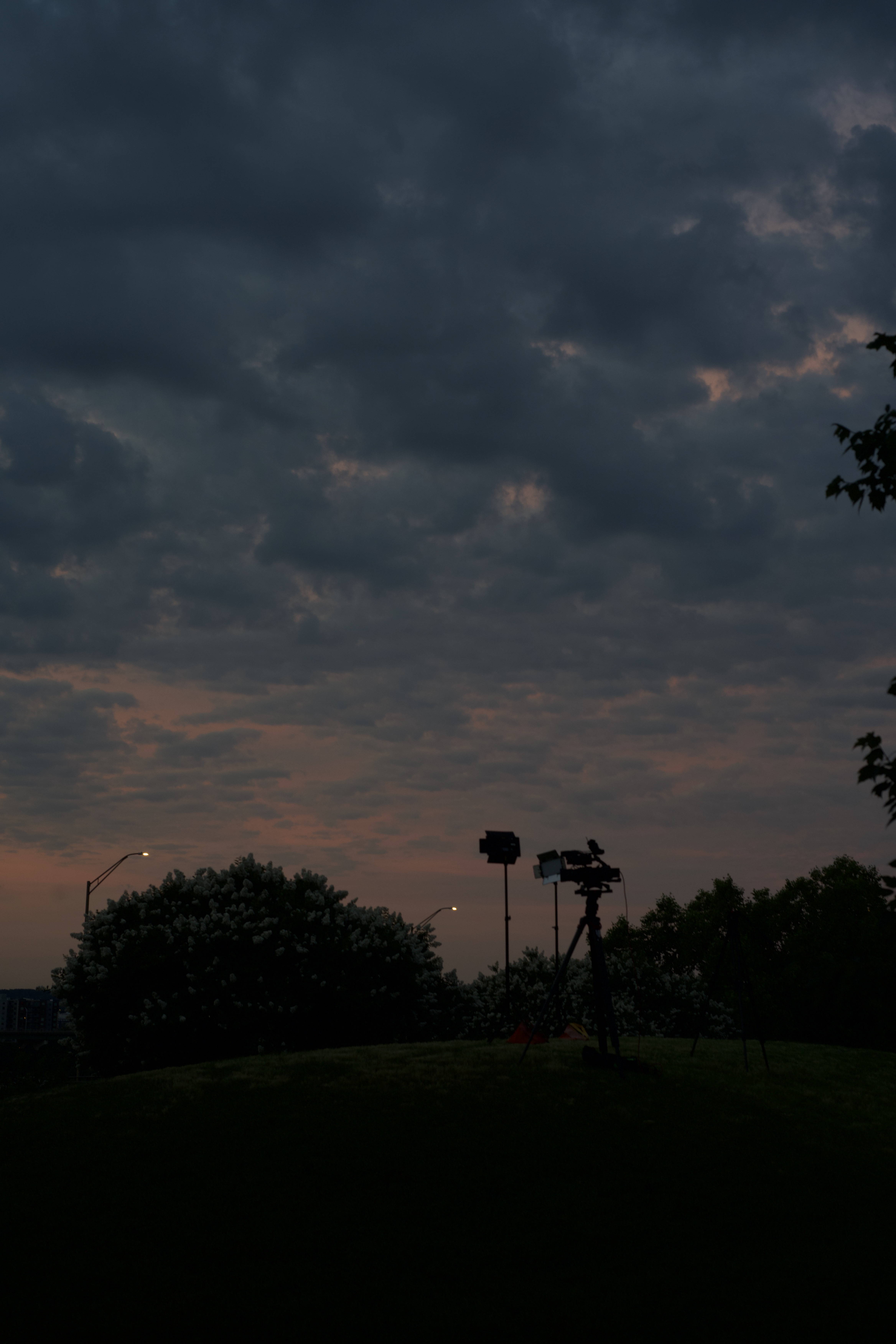
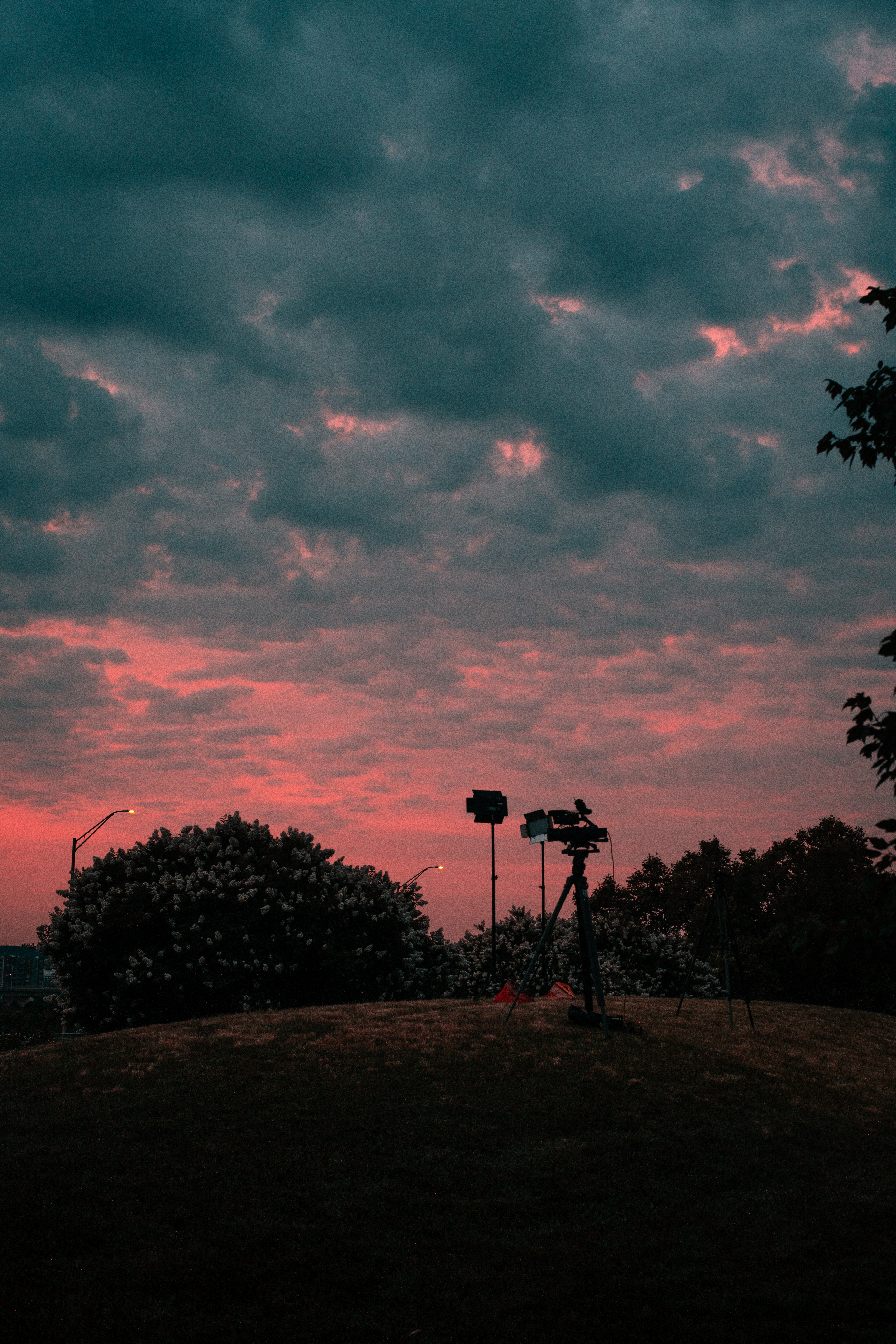
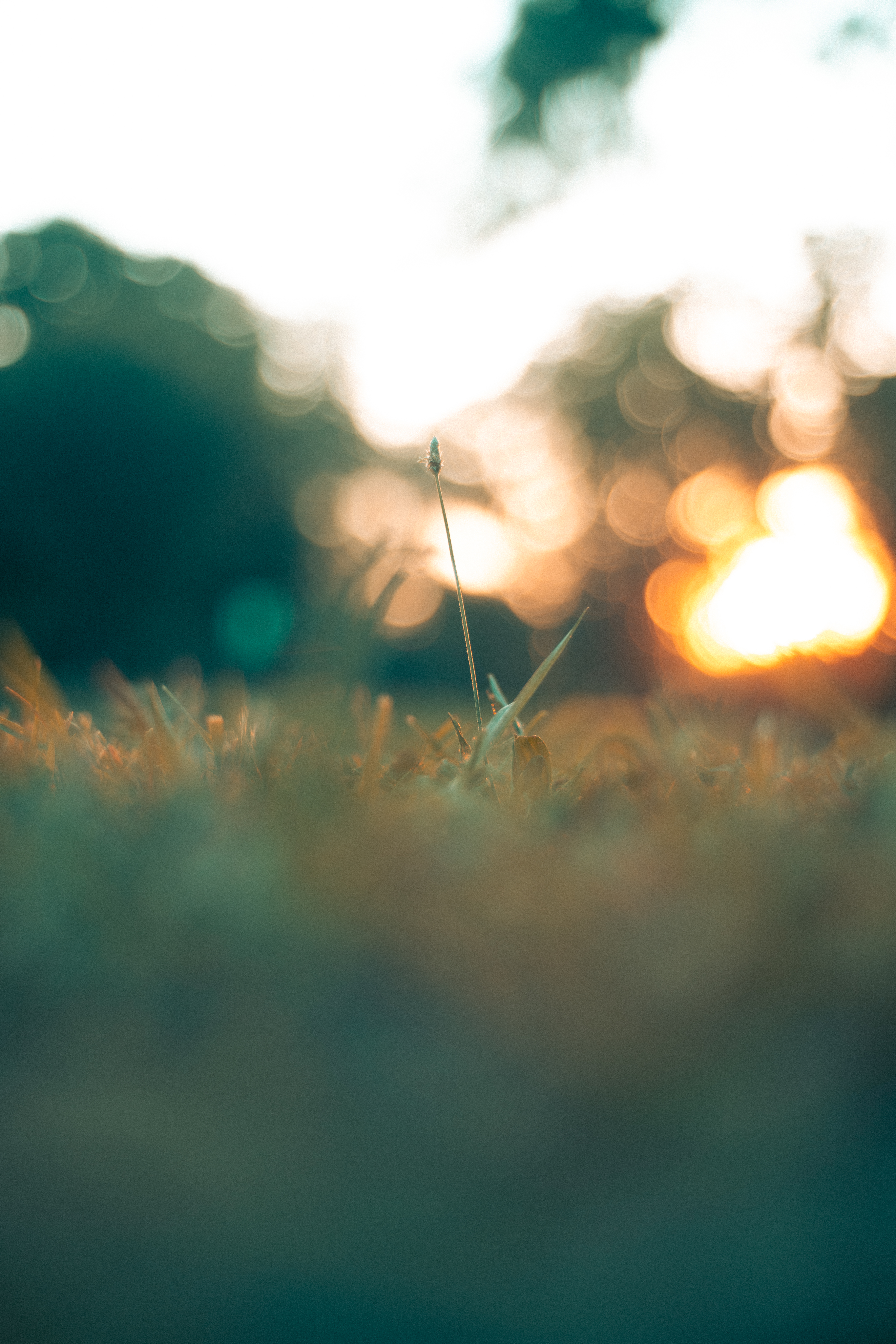
Since then, I’ve been applying some form of color correction to most of the pictures I’ve taken. It’s been mostly my new teal/orange preset, but I’ve been trying to expand. For example, this image of our live shot setup at sunrise, I loved the pink in the clouds and tried to really single that out by muting the green and yellow of the grassy hill.
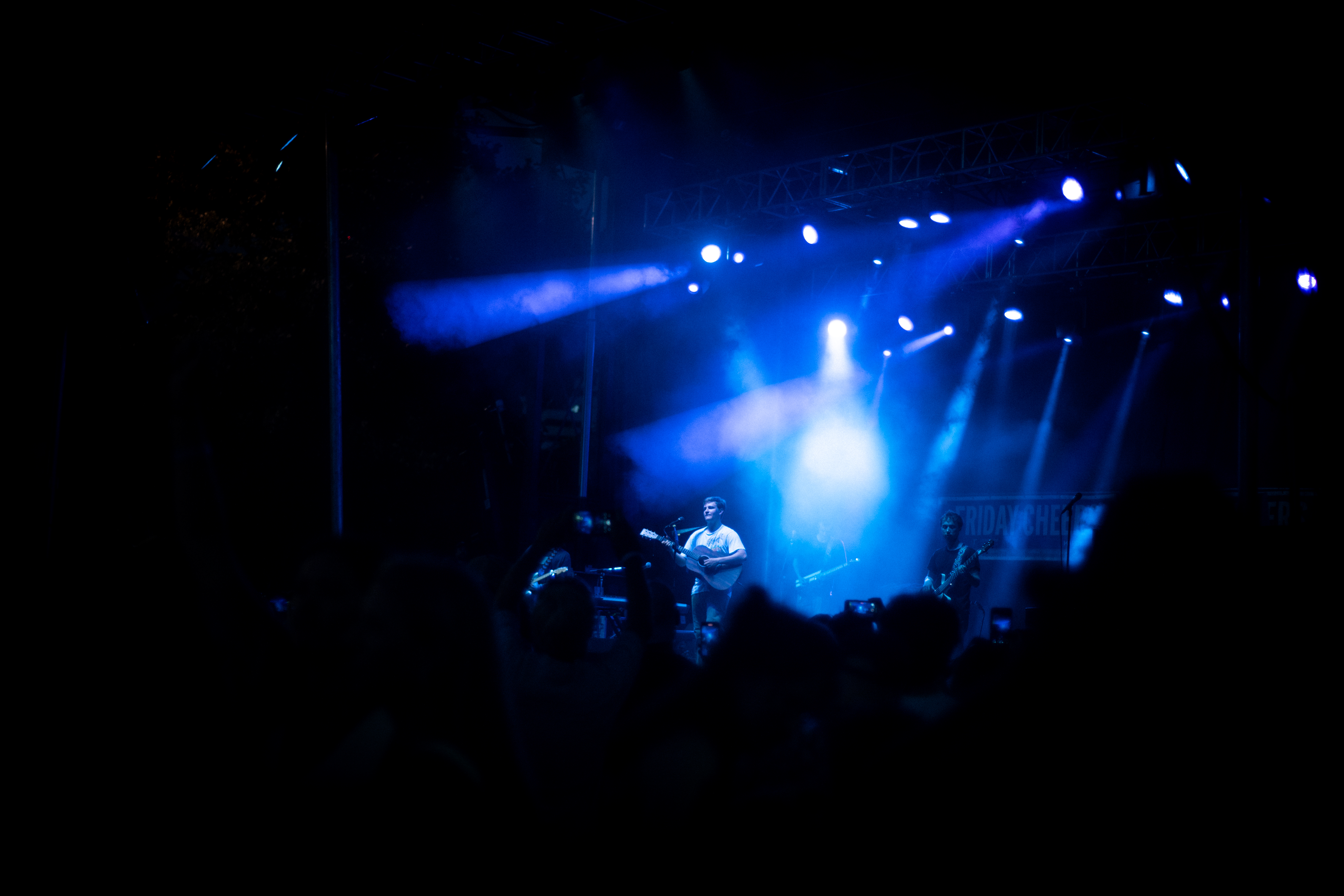
Finally, using these new practices, I was able to enhance some concert images I shot last Friday. Rather than playing with the vibrant slider aimlessly, I’ve been more selective about how I want to augment the color in an image. Obviously the colors from the stage helped guide my decision-making but it was really great practice for me.

I’m enjoying this new creative tool in my editing toolbox, and look forward to using it in more of my work. How do you use color in the edit to add to your images?
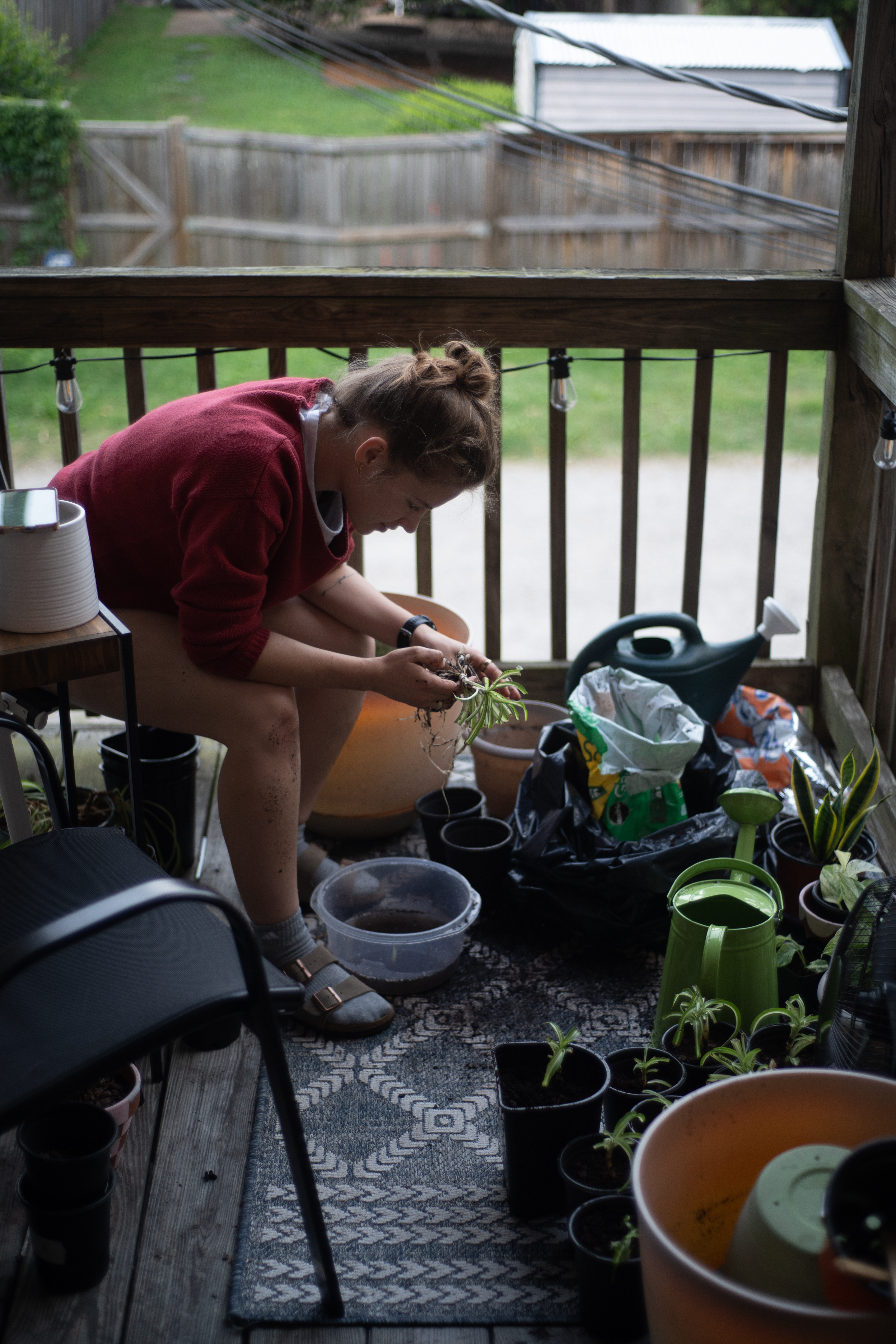
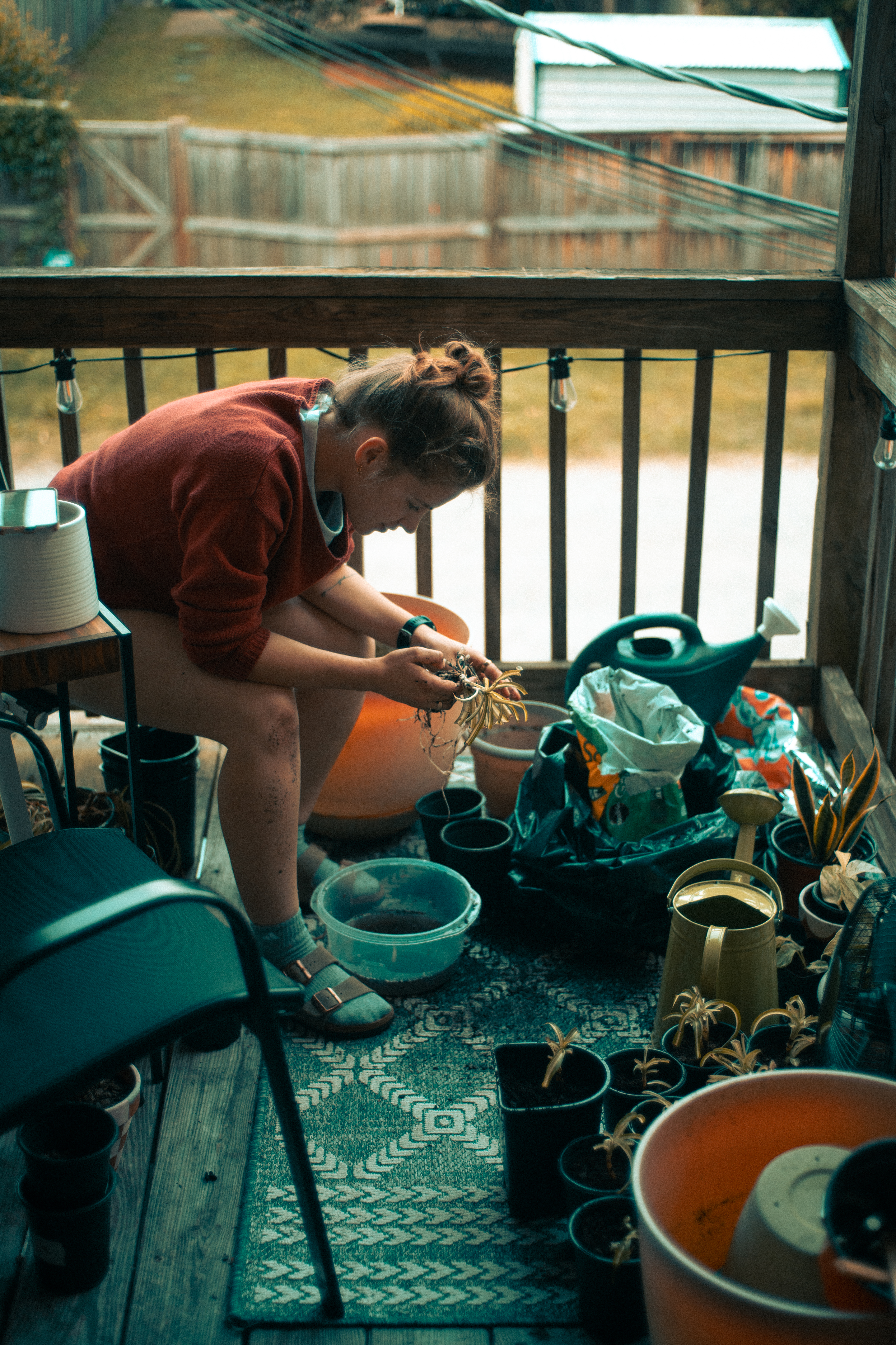
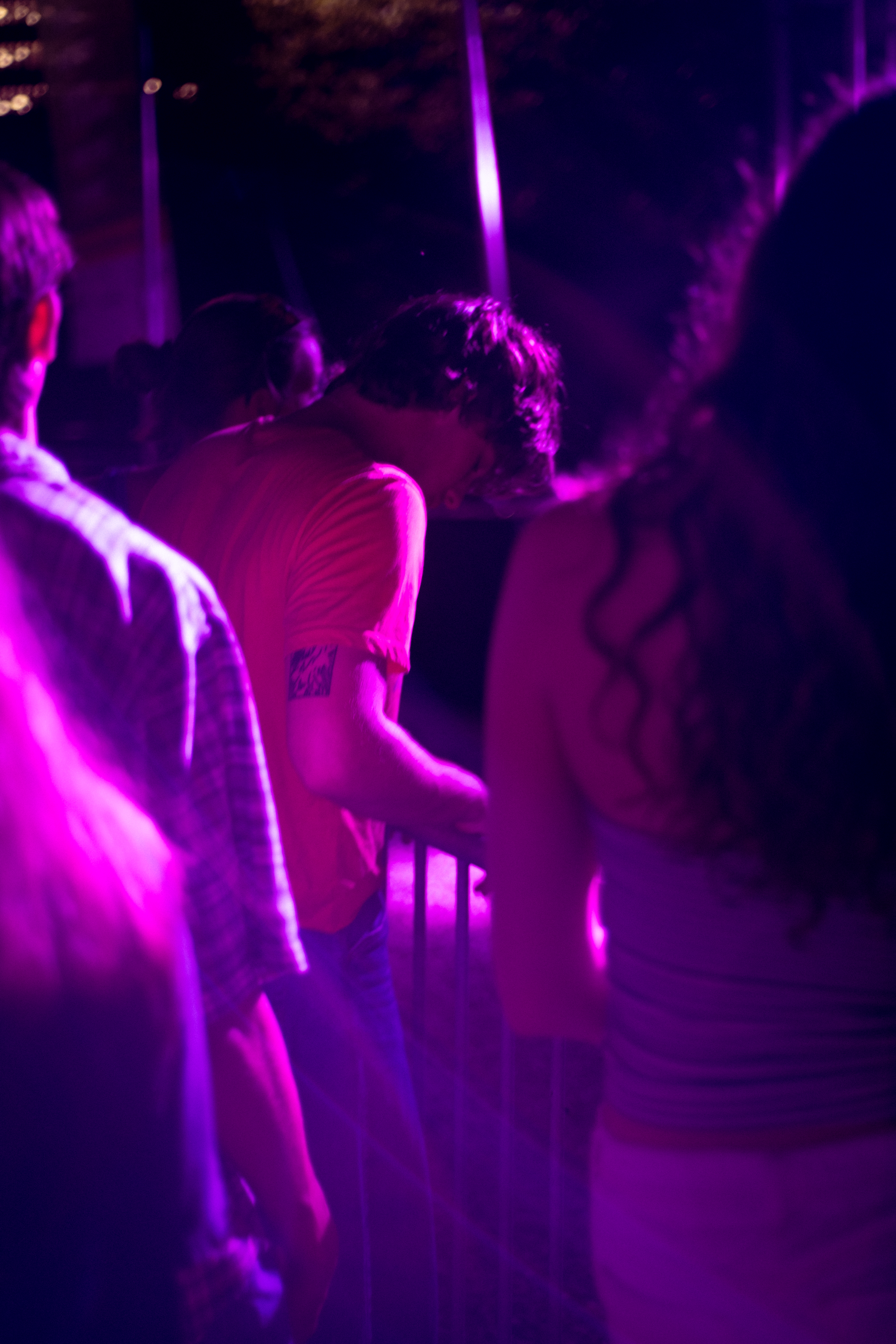
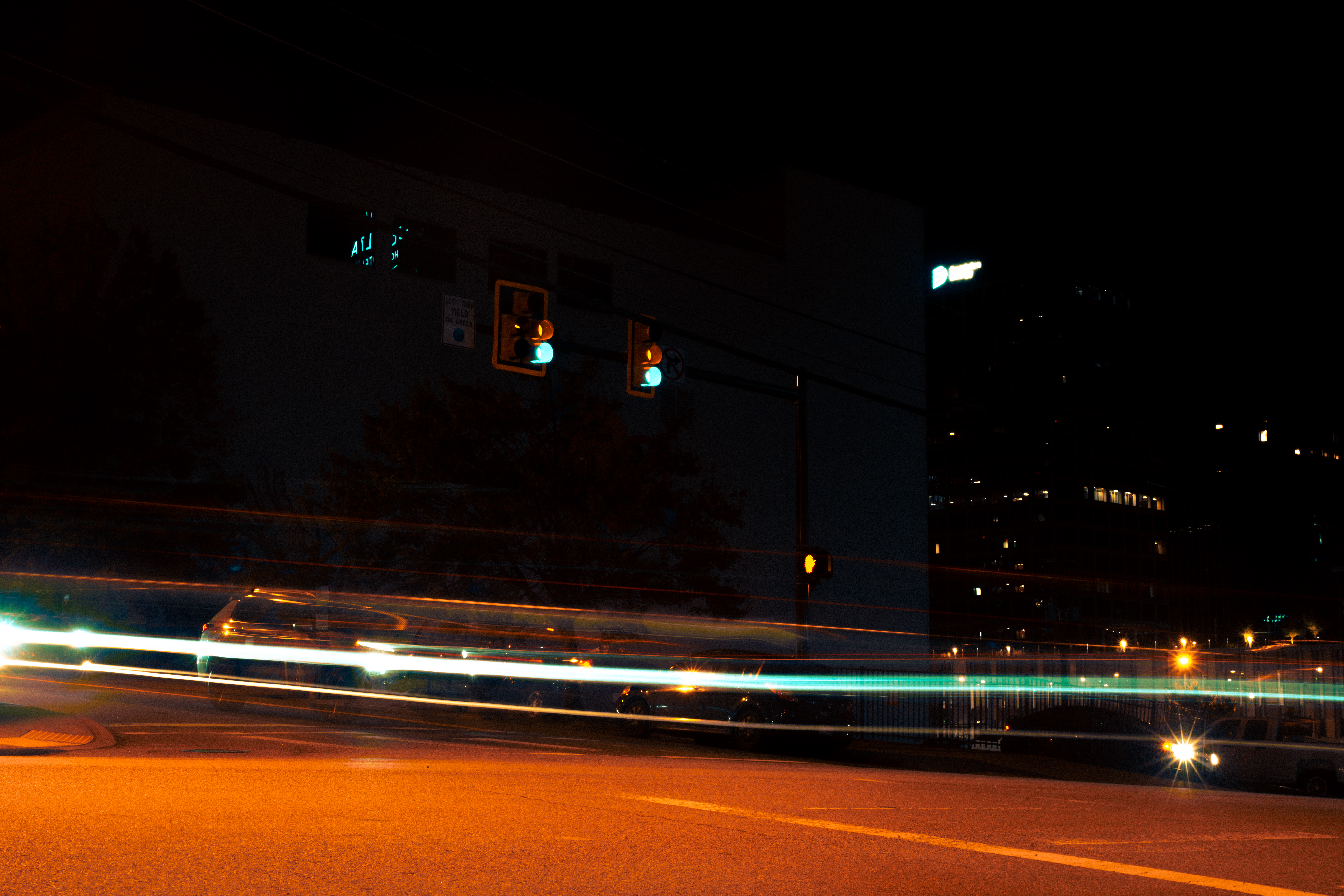
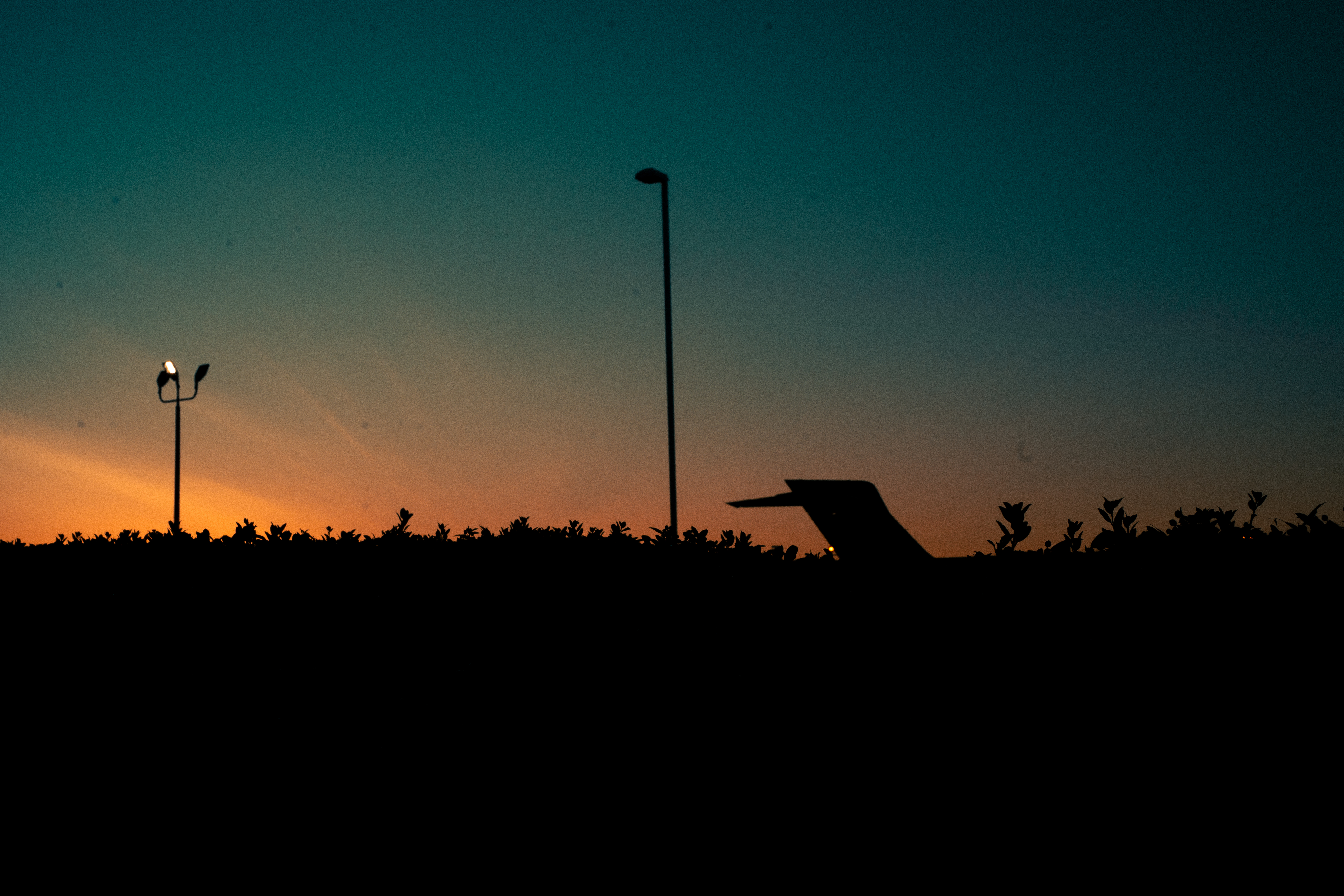
more images I’ve been color correcting


Leave a comment